A Slanted Hexagon
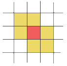
We've known for a while that the easiest way to simulate hexagonal cellular automata on a square grid is to use a slanted neighborhood:
(I don't know who first thought of this, by the way. There's a reference to it from June 1971, for example.)
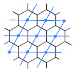
It works because the hexagonal tiling can be lined up with a (slanted) square tiling, like this:
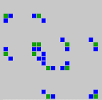
Using this slanted neighborhood in Golly we can run interesting CA, like Frank Buss' HexLife:
The problem is that it's supposed to look more like this:
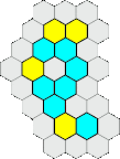
It needs hexagons to show the connections between the cells properly.
For the moment we're not about to start changing Golly to render this properly. We may do in the future. For now we have a Plan B, which is to use icons to show the hexagons instead. The problem is: what should the icons look like?
After playing with a few candidates and not getting very far I sat down and thought about it and came up with an answer that seems right and is quite satisfying. Here's my reasoning:
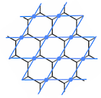
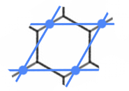
Here's the dual of the square tiling in the earlier image, showing how our hexagon icons should lie on top of our squares:
The problem now is that the hexagons lie partly outside each square, and we can't draw those bits because we don't know what colour those cells should be. A nice solution is to inset the hexagon just enough that it fits in the square:
Now imagine un-slanting the blue square, taking the red hexagon with it. This gives us the shape we're looking for:
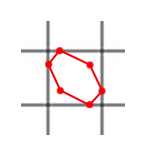
With a little thought you can work out that the coordinates of the corners are all multiples of 0.25. Clockwise from top: (0.25,0) (0.75,0.25) (1,0.75) (0.75,1) (0.25,0.75) (0,0.25)
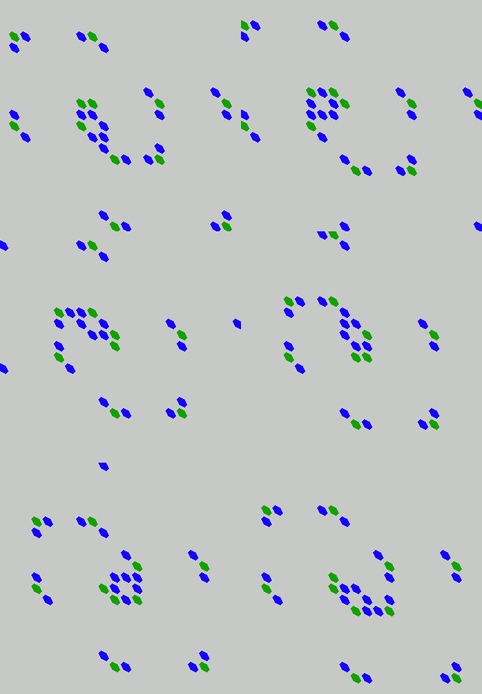
Now we can fill in the slanted hexagon with whatever colour we want and we're good to go. Here's an animation of Frank Buss' CA in action. A spinning emitter sends out gliders in all six directions.
And here's a simple snowflake CA:
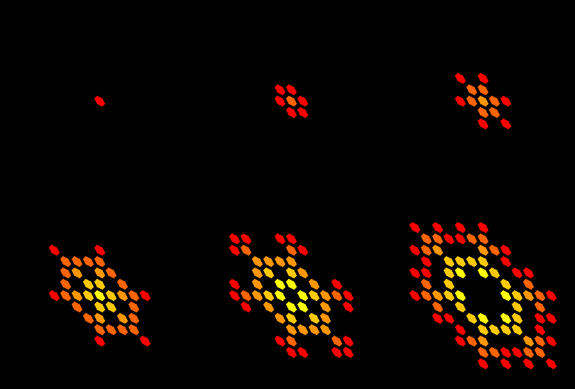
It looks pretty good, apart from the slanting of course. The gaps between the hexagons are just about acceptable. Let me know if you can think of a better way of doing it.
I won't even show you my earlier efforts which I'm just embarrassed about now. This solution is so obviously right I should have thought of it earlier.
Support for hexagonal neighborhoods will be arriving in Golly 2.2, hopefully within a couple of months. Until then you can always build the latest source yourself.
The only downside of these new icons is that it takes the pressure off Golly ever needing to render hexagonal grids properly...
Edited: to match earlier conventions we've chosen the other slanting direction, so I've changed the images to match.
 | corresponds to |  |
(I don't know who first thought of this, by the way. There's a reference to it from June 1971, for example.)
It works because the hexagonal tiling can be lined up with a (slanted) square tiling, like this:

Using this slanted neighborhood in Golly we can run interesting CA, like Frank Buss' HexLife:

The problem is that it's supposed to look more like this:

It needs hexagons to show the connections between the cells properly.
For the moment we're not about to start changing Golly to render this properly. We may do in the future. For now we have a Plan B, which is to use icons to show the hexagons instead. The problem is: what should the icons look like?
After playing with a few candidates and not getting very far I sat down and thought about it and came up with an answer that seems right and is quite satisfying. Here's my reasoning:
Here's the dual of the square tiling in the earlier image, showing how our hexagon icons should lie on top of our squares:

The problem now is that the hexagons lie partly outside each square, and we can't draw those bits because we don't know what colour those cells should be. A nice solution is to inset the hexagon just enough that it fits in the square:
 | becomes | 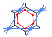 |
Now imagine un-slanting the blue square, taking the red hexagon with it. This gives us the shape we're looking for:

With a little thought you can work out that the coordinates of the corners are all multiples of 0.25. Clockwise from top: (0.25,0) (0.75,0.25) (1,0.75) (0.75,1) (0.25,0.75) (0,0.25)
Now we can fill in the slanted hexagon with whatever colour we want and we're good to go. Here's an animation of Frank Buss' CA in action. A spinning emitter sends out gliders in all six directions.

And here's a simple snowflake CA:

It looks pretty good, apart from the slanting of course. The gaps between the hexagons are just about acceptable. Let me know if you can think of a better way of doing it.
I won't even show you my earlier efforts which I'm just embarrassed about now. This solution is so obviously right I should have thought of it earlier.
Support for hexagonal neighborhoods will be arriving in Golly 2.2, hopefully within a couple of months. Until then you can always build the latest source yourself.
The only downside of these new icons is that it takes the pressure off Golly ever needing to render hexagonal grids properly...
Edited: to match earlier conventions we've chosen the other slanting direction, so I've changed the images to match.
This post was originally on LiveJournal.